Home ← TI-Nspire Authoring ← TI-Nspire Scripting HQ ← Scripting Tutorial - Lesson 19
Scripting Tutorial - Lesson 19: Guidelines for Lua Nspired Authoring I
Download supporting files for this tutorial
Download this page in PDF format
Texas Instruments TI-Nspire Scripting Support Page
WORKING ACROSS PLATFORMS (Create Once Play Everywhere)
So now you plan to create your own documents using Lua and TI-Nspire?
Whether professionally or for your own students, it is important that the documents you create offer the optimal experience for the user. In the end, the primary intent is to create an effective learning experience, and this will not happen if design and usability issues get between the user and the lesson content.
The guidelines described in this and the following tutorial are proposed as useful considerations which should serve to ensure that your documents will work well, wherever they are used.
The two critical variables described here concern the way that documents present across the various TI-Nspire platforms (design and display considerations - Lesson 19) and usability issues (Lesson 20) - ensuring that the document will be as easy and effective to use on the handheld as it is in the Player or in the desktop software - or anywhere else!
1. Display Considerations: Looking Good Everywhere!
The primary consideration when creating Lua Nspire documents is to ensure that, whether viewing in handheld or computer mode, whether on Player, PublishView or other platforms, that the document scales correctly and that the user experience is effective. A key advantage in the use of Lua documents over those created using native TI-Nspire functionality lies in the potential guarantee that, correctly scripted, such documents will read and present effectively in all possible views. In spite of substantial efforts in this respect, native Nspire apps (especially Graphs & Geometry) remain difficult to control in this respect.
The Math Nspired document for Arcs and Sectors offers a nice illustration of this point. The first two images show a page from the original file: first in handheld view (nice!) and then in computer view (yuk!). This is followed by a Lua conversion of this page (thanks to John Hanna!), again in handheld and then computer view. The other advantage of the Lua document is that the point moving around the circumference of the circle can be controlled simply by pressing the arrow keys - no need to arrow around the screen, trying to grab and move points on the handheld, but equally effective using the mouse in computer view. This will be the focus of further discussion in Lesson 20.
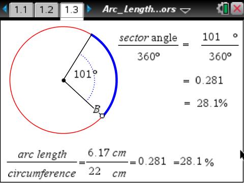
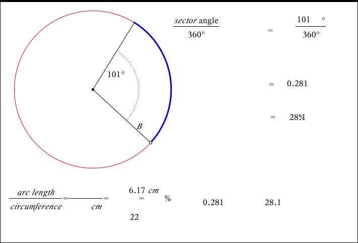
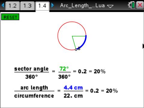
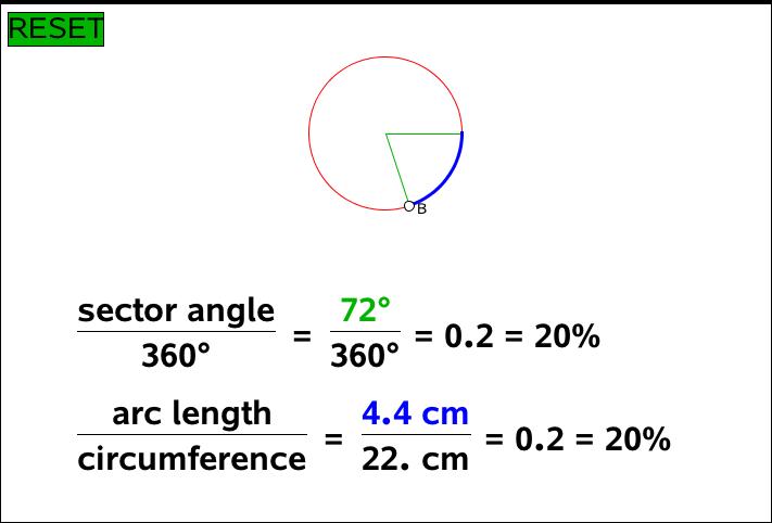
There is one fundamental golden rule: All size and position references must be relative to the screen size. NEVER use absolute values for position or size, even initially, since these will most likely work fine in one view and badly in others.
1.1 Relative NOT Absolute
This is most easily achieved by defining variables for width and height, such as
W =
platform.window:width()H =
platform.window:height()
Position variables then should be expressed in terms of these. For example, the initial position of an object could be W/2, H/2 to center on the page. Similarly for sizes (see 1.3 and 1.4 below)
1.2 function on.resize()
It is most effective if these global variables are defined within an on.resize function so that they are called whenever the page dimensions are changed. This routine is also called when the page is created, and so is suitable as a place to define initial values of variables and objects.
The resize function can be easily called in, for example, on escapeKey() or as the result of mouseDown within a button.
1.3 Relative Object Sizes
Defining the dimensions of symmetrical objects such as circles and squares is best achieved by choosing either W (platform.window:width) or H (platform.window:height) and sticking to this value. So, for example, the initial width and height of a circle or square could both be a relative value like W/30.
1.4 Relative Font Size
The font size can be linked to a value such as the page width in order to ensure that larger screens will display larger text. Taking the standard width of the handheld window as 318 pixels, then we might define a variable
fontSize = W/32
and this will result in a font size close to 10 on the handheld. The value will be automatically rounded to a whole number for use in the setFont command, but the use of the math.floor function will ensure that an integer value results (and adding 0.5 ensures that the value is always closest to the original). There is a minimum value of 6 for font size (and a maximum of 255). In order to guard against the former, then a better definition might be
fontSize =
math.floor(W/32 + 0.5) fontSize = fontSize >= 6 and fontSize or 6fontSize = fontSize <= 255 and fontSize or 255
NOTE: Thanks to Andy Kemp for pointing out that, while the computer can handle font sizes between 6 and 255 point, the handheld is restricted to 7, 9, 10, 11, 12 and 24. Using the limits above will not cause any problems on the handheld (it will read 6 as 7, and anything above 24 will get capped) BUT it does mean that there will be times when the page will appear differently on the handheld than it will on other platforms.
If you wish to try and ensure consistency as much as possible, then the following would be the safer (but more limited) option:fontSize =
math.floor(W/32 + 0.5)fontSize = fontSize >= 7 and fontSize or 7
fontSize = fontSize <= 24 and fontSize or 24
1.5 Intended Page Size - Another Approach
With thanks to Alfredo Rodriguez
The methods described above are probably the simplest way to ensure that your document will scale well for different page sizes and different platforms. However, another approach does offer some advantage. It consists of defining an "intended page size" initially, and then scaling to that size.
Begin by defining your intended page size. One obvious choice would be the size of the handheld window so that documents so created will certainly work in this limited space, but then will scale up from there.
local iW = 318
local iH = 212
Initially, too, define a scale factor:
local sf = 1
An interesting variation on the standard Paint function is shown next. Study it carefully and see if you can understand the intent.
function
on.paint(gc)on.paint = onPaint on.resize = onResize-- Enable handlers
-- Call initial onResize
onResize(
platform.window:width(), platform.window:height())-- Call initial onPaint
onPaint(gc)
end

