Getting Started with
Probability and Statistics
Stephen Arnold
There has sometimes been a tendency in the past to focus upon the function graphing and calculus capabilities of graphic calculators, which are indeed impressive. Equally impressive, though, are the data representation and manipulation features with which these tools are equipped. From simple statistical calculations and plots to probability distributions and powerful inferential statistical tools, graphic calculators have transformed the study of statistics at both school and university levels. Access to these tools has dramatically shifted the emphasis from calculation to interpretation.
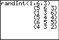
The following activities introduce some of the principal statistical and probability features of the TI-83 and TI-83 Plus. Of course, it is worthwhile beginning with the MATH->PROB menu and, in particular, the useful randInt command. The example shown simulates rolling three dice repeatedly, and offers a very simple way to produce a string of random numbers, which may be stored to a list.
Consider, too, the availability of nCr and nPr functions, including applications such as generating the binomial coefficients and storing these into lists, as shown.


Learning Activity 1: Data, data everywhere
AIM To draw on student generated data in order to introduce a variety of statistical plots, linear regression and correlation.
METHOD Students record birthday data (days and months) and explore relationships.
PROCESS Students carry data around with them all the time. They especially enjoy birthday data, since it is personal and fun. It is also surprisingly revealing statistically.
This activity can involve just one teacher ViewScreen™ calculator into which class members enter their birthdays, or students can enter the data onto their own calculators as it is called out. The activity works best with a good size class – around 30. If the class is small, then members can enter their own birthdays and those of one or two loved ones to increase the sample size. It provides a useful introductory activity for the use of statistical features of the calculator, and has been used often as a first exercise for students.
Into L1, enter the day of the month of each class member (numbers from 1 to 31). Into L2 will be entered the month of their birth (numbers from 1 to 12). By the way, students will naturally look out for “birthday buddies”. Talk about the likelihood of these occurring and perhaps discuss the somewhat surprising result that, in a class of 30, the probability is over 70% that at least two people will share the same birthday!

Some discussion is useful concerning what students expect regarding the means and medians of these two sets of numbers. Most students should readily agree that the middle of the first group should be 15 or 16, while that of the second should be around 6. They should then choose STAT->CALC-> 1:1-var Stats to study the statistics for both lists (on the home screen, add either L1 (2nd-1) or L2 (2nd-2).)
From the StatPlot menu, turn Plot1 on and select the modified box-and-whisker plot to display L1 (as shown). Then turn on Plot2 to display L2 in the same way, displaying both on the same set of axes (Zoom 9: ZoomStat is appropriate here). While the resulting plots are hardly surprising, they illustrate clearly the usefulness of box plots for comparison of data.
Next discuss the scatter-plot that will result from plotting L1 against L2. What do students expect to see? The correct answer here, of course, is nothing! The scatter-plot should be random, with points all over the screen.

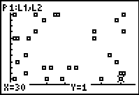
It is now appropriate to introduce the concept of zero correlation – students will immediately appreciate this concept. Note, too, that if the points are TRACED, then each member of the class has a place on the screen! Ask them to observe their spot, and think about what that means.
Now go back to the STAT menu and choose option 2:SortA( (Sort Ascending). Sort both L1 and L2.
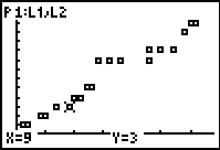
Importantly, discuss what students might expect to see from a scatter-plot of the data now! View the data by going back to the list editor (as shown). Students should realise that the data now bears no relation to themselves: the link between days and months has been broken. These are just two sets of random numbers, in ascending order.
As should be expected, however, the plot appears surprisingly linear! Once again, discussion follows, leading to further work on correlation – much closer to 1.
The opportunity to attempt a linear model here is too good to pass up. Begin with Y1 = X, and students (individually or in small groups) should attempt to find the line of best fit for this data set. For example, the line Y1 = 0.4X is shown.

This activity will generate some discussion and, ideally, some arguments and disagreement about what constitutes a “line of best fit”. Different groups will arrive at different results and will claim that their result is superior to those of others. Grasp this teaching moment and ask groups to justify their point of view.
This leads naturally into the variety of methods used to compute such lines of best fit, and again attention may be drawn to the two methods available on the calculator. The Med-Med regression, like the median itself, is largely unaffected by outlying results, interested only in the numbers of scores, not the value of those scores.
The linear regression model behaves more like the mean, and is affected by outlying scores. In the example shown, we might expect little difference between the two models, since the scores are fairly tightly packed, with no outliers. Note that this equation fits in well with our estimated line of best fit, with a gradient close to 0.4 and a y-intercept close to 0.

To reveal the correlation coefficient (r) it is necessary to use the CATALOG (Shift-0) and choose the command DiagnosticOn.
After choosing in turn, linear and median regression lines from STAT->CALC, enter L1, L2, Y1 (and then Y2) at the home screen. (Y1 and Y2 may be found under VARS->Y-VARS->Function…)
The resulting graph, as might be expected, displays two very similar “lines of best fit”.
Finally, did you know that you can even create “dot plots” using the graphic calculator?
Clear all other plots, and return to the list editor (STAT 1). We will create a dot plot for the months in L2. In L3, simply count each different term of the ordered L2 (as shown).
Then set the scatter plot to display L2 and L3, and the result is quite effective. Discuss with your class why this graph-type might not be appropriate for the data in L1.


Learning Activity 2: What is Normal?
AIM To introduce the normal probability distribution and its key properties.
METHOD Students use the calculator tools available to analyse the normal distribution..
PROCESS The concept and properties of the normal probability distribution are of particular importance to candidates external examinations, and it is of some benefit for them to understand the implications.
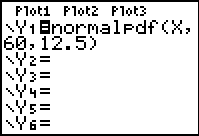
This activity begins with a visual display and subsequent discussion of a normal distribution. We begin with one which has a mean of 60 and a standard deviation of 12.5, since these are the properties generally used by the New South Wales Board of Studies for HSC examination results.
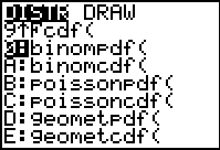
The normalpdf( (normal probability distribution function) may be found as the first item in the DISTR menu (Shift-VARS, just below the blue arrow keys). For this activity, students should begin in the Y= menu, in Y1 (all other functions and stat-plots should be off). Go to the DISTR menu and select item 1, depositing normalpdf( into Y1, as shown.
Students should next go to the WINDOW menu and set the Window Settings as shown. Finally, press GRAPH.
The familiar shape of the bell-shaped curve appears, and students (using the TRACE facility) should notice at very least that the mean coincides with the modal value, as the “high point”. The further above and below the mean, the fewer and fewer scores may be found. In the context of an examination, students should explore the extremities, observing that very few students will score below around 25 or above 100. While in TRACE mode, simply entering a value (such as 60) will take the cursor directly to that point. Observe that the y-values (heights) are percentages, and should be multiplied by 100 to be meaningful. Discuss the implications.


It may be timely to refer at this point to other examples of the occurrence of the normal distribution: everywhere from heights and weights to the numbers of eggs laid by 1000 chickens each day in a hatchery; even to the differing sizes of bolts produced in a factory.
Have the students return to the Y= menu and change the mean from 60 to 0, the standard deviation from 12.5 to 1 (thus, Y1 = normalpdf(X, 0, 1)). Adjust Window Settings as shown, and then view the graph. Discuss the features of this general normal distribution curve.
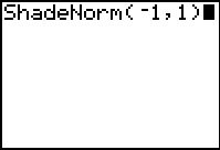
It is now useful to consider the areas under this curve between particular values, since these provide probabilities of events occurring within a specified range. For this purpose, we return to the DISTR menu, but right-arrow across to DRAW, then choose 1: ShadeNorm(. Entering –1 and 1 on the home screen as shown produces, not only the shaded normal curve between these values, but the area, indicating approximately 68% probability of a score falling within 1 standard deviation from the mean in a normally distributed population of scores.


Clearly this will need to be discussed with students: give examples from different tests: for a test with a mean of 65 and a standard deviation of, say 15, then we expect over two thirds of students to score marks between 50 and 80. Use the term probably to describe this situation.
Students should now investigate the probabilities associated with scores falling within 2 and 3 standard deviations either side of the mean (arriving at probabilities close to 95% - very probably - and 99.7% - almost certainly - respectively).
After further discussion and exploration, it is helpful to draw students back to the Higher School Certificate scenario. Ask them to make predictions related to different scores in the HSC: between what scores will students almost certainly fall? What does this mean for them? Between what scores will candidates very probably fall? Plot the normal curve again for a mean of 60 and a standard deviation of 12.5, and ask students to verify that the probabilities for the different intervals (in this case, between 47.5 and 72.5, between 35 and 85, and between 22.5 and 97.5) correspond to those already encountered.
The introduction to the concept and formula for z-scores can occur prior to this activity, or following it. After visualizing the two normal distribution curves (for mean of 60 and standard deviation of 12.5, and that for 0 and 1), it is readily seen that the curves are identical in shape. Hence it is possible to move easily from one representation to the other, and the formula which performs this transformation may be now appreciated.
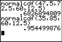
A simpler approach (less visual but certainly more efficient) involves another option from the DISTR menu, 2:normalcdf(, which is the normal cumulative distribution function. As the name suggests, this provides the accumulated value between two given points, or the area under the curve. The probabilities between 1, 2 and 3 standard deviations from the mean are easily verified as 68%, 95% and 99.7%.


It is similarly easy to verify that, for a mean of 60 and a standard deviation of 12.5, scores of 47.5 and 72.5 correspond to –1 and 1 standard deviations away from the mean, while 35 and 85 lie exactly 2 standard deviations away.
Finally, if we wish to know what score would be needed in order to lie ahead of 90% of students, then the invNorm command readily offers such information: for a mean of 60 and SD of 12.5, this would be a score of 76 (approximately 1.28 standard deviations above the mean).
The normal distribution describes data which is continuous, usually that which involves some form of measurement in order to produce the scores. While many real-world activities from a surprising range of sources may be described in this way, it is also useful to be able to describe discrete data, and for this we may use, among others, the binomial distribution.

Learning Activity 3: Win or Lose
AIM To introduce the binomial probability distribution and its key properties.
METHOD Students use the calculator tools available to analyse the binomial distribution.
PROCESS When modeling discrete data, such as that resulting from trials with only a limited number of outcomes, we need to use other distributions than the normal distribution. Situations in which there are repeated independent trials with only two possible outcomes, and the probability of success remaining constant, may be described by the binomial probability distribution (sometimes called the Bernoulli distribution).
Students will readily identify with games or experiments which produce either a “win” or “lose” result: from tossing coins to rolling dice to drawing lotto numbers, they have been using such examples since they first commenced their study of probability concepts. The graphic calculator is well suited, once again, to visualizing and answering questions about such data.
Consider, for example, rolling a die 30 times: what is the probability of, say, 5 sixes? In the example shown, we enter the number of trials, the probability of the “winning event” and the number of times we wish this event to occur.
If we were interested in, say, tossing a coin 4 times, then the probabilities of each possible outcome can be expressed (in either decimal or fraction form – within reason!) in this way. Storing the results to L2 and entering the numbers {0, 1, 2, 3, 4} into L1 (try using seq(X, X, 0, 4) from the LIST->OPS menu) allows us to view the plot, as shown.
It is worth discussing the symmetry of this graph with your students, and comparing it with that of, say, rolling a die 10 times. In the context of the first graph, students should discuss times when it might be useful to approximate a binomial distribution with a normal distribution.


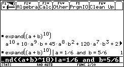
Finally, it would be good use of CAS to link the numerical study of the binomial distribution with the algebraic expansion of a binomial product. Students may readily link each numerical value with the appropriate algebraic term, and observe too that the sum of all probabilities is always 1.
Using the list of binomial coefficients generated in the introduction, students might even compare the results of the binomial formula with those generated by the binomialpdf function, as shown. A very convincing activity linking algebra with statistics!

Some Problems
(with thanks to Neville Windsor, Hellyer College, Burnie, Tasmania)
1. An ordinary die is rolled 240 times. What is the probability that the number of “sixes” obtained is between 35 and 50 (inclusive)?
Clearly this is an example of a binomial distribution in which n = 240, p = 1/6 and q = 5/6.
The formal calculation for this problem looks like this:
This is a very tedious calculation to carry out (although using the LIST functions of a graphics calculator does make it feasible). The answer is 0.7917 (correct to 4 decimal places).
Here are some other approaches. The first stores the numbers from 35 to 50 to L1, calculates the binomial probability of each and stores these to L2, then simply sums L2.
Perhaps even simpler: use the binomial cumulative distribution function to find the total probability up to 50 terms, then subtract the total up to 34 terms, leaving the probability between 35 and 50.
Finally, perhaps an even sneakier approach, in which we approximate the binomial distribution with a normal distribution (possible because of the large number of trials).
To use a normal approximation firstly requires a determination of the mean and standard deviation of the binomial distribution. Using the standard formulae gives:
and
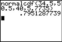
The following calculation is then required:


[Note the continuity correction here]
Thus the normal approximation gives an answer which varies from the “correct” answer by only about 0.4%. It should be pointed out that using the normal distribution capabilities of a graphics calculator makes the conversion to “z-scores” unnecessary, although the conversion was done in the example above.
Now try this one:
- A city has two hospitals. In the larger hospital there is an average of 45 babies born each week, and in the smaller hospital there is an average of 15 babies born each week. In any given week, which of the two hospitals is more likely to have 60% or more of their babies being boys?
This is binomial, in which we wish to find the probability that 27 or more boy babies are born out of 45 at the first hospital, and 9 or more out of 15 are boys at the second hospital. One approach is shown. Can you find other ways to do this?
Is this result surprising? The smaller hospital has almost 3 times the chance of the larger that more than 60% boys will be born in any week.
Would a normal approximation be appropriate here? Why or why not? Try it and see the result!
